Charts are visual ways to show information.
This exercise focuses on how charts can distort information.
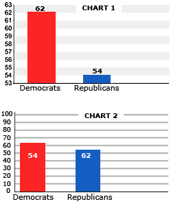
Sometimes charts do not accurately display facts due to a simple error. For example, the labels on two bars get switched by mistake, and show the opposite of what the facts show.
In other cases, the person who creates the chart wants to make small differences seem much bigger than they really are. This happens when:
1. the vertical Y axis does not start from 0.
2. the horizontal Y axis has very small divisions.
These two distortions can make the differences between the bars seem much bigger than they really are.
Read the following facts. Then answer the question below.
Both charts below do not accurately reflect results of the survey. One chart shows a simple mistake that is easy to make. The other chart presents the results of the survey in a very misleading way. Which of these two charts is trying to influence what people think about the results of the survey? Choose ONE correct answer.